Recently we (and our good friends from Green Igloo) have been fortunate enough to be appointed to do the technical drawings for a grass roof extension in a beautiful area of Derbyshire. The client had a few questions about the appearance of the eaves and the way it could go together. Seemed like a perfect opportunity to put pen to paper and give them an indicative sketch.
A Warm Welcome
On this blog we hope to share some of our work as well as review artist materials, books and share some of the places we visit. Posts will be by Al (Architectural Detailer/Technician & Illustrator) or Jenny (Artist & Webmaster). Both of us are company directors with hands on experience of running a small business.
Sunday, 9 February 2014
Saturday, 9 November 2013
Swinderby Church in Sepia Inks
 I have been using brown and sepia tone inks for a number of years now, however last month I decided to experiment with the technique a little further and attempt to make some improvements. I chose the subject of the church in Swinderby, Lincolnshire. The sandstone on the main church together with the timber framed and shingled gate seemed to lend itself well to the possibility of a monotone illustration. The many years this church has stood within the village and the long effects of the weather have also softened the materials and edges, adding to the beauty of this wonderful old building.
After outlining the illustration in a light pencil line onto watercolour board I applied a brush wash of the diluted Winsor & Newton peat brown drawing ink to add in the sky and base tones. The ink can be added in layers to build up the wash effect and colour depth but I have never been entirely happy with the ink when applying it with a dip pen and I have stayed away from using it with Rotring Isograph technical pens for fear of ruining the nib. For this reason I switched to the Winsor & Newton sepia calligraphy ink.
The calligraphy ink, was both predictable and gave a deep defined colour from both the technical pen and the dip pen allowing me to get the definition I wanted around the foliage, forms and the shadows. All in all I was pleased with the combination and performance of the different inks. A little knowledge and experimentation with different types of inks is well worth while for those who wish to get familiar with the medium and will help control the extremes of wash and depth to gain the effect desired for the subject.
Saturday, 28 September 2013
Stone Pillar for Set
Here is an initial sketch for a stone effect pillar for a guards gate set.
Possibly built from layered sheets of plastazote the intention is for it to be light, stackable and as safe as possible should anyone fall onto it during use.
The recess and flat top surface would allow for removable led lanterns or glow sticks to sit on it.
The base would fix to the ground to try & prevent it blowing away during windy events. This would need covering with foam rubble and artificial greenery to allow it to blend in.
Sunday, 18 August 2013
The Detailing of Industrial Architecture
Over the years we have had an involvement in many different fields of architecture, one of these is the industrial sector. It may not have the appeal of working with historical buildings or the higher specification of materials and costs of leisure or retail, but it still requires care and precision. Many of the challenges are the detailing of fire walls, the coordination of process equipment and services together with the requirements of the structural engineer.
The tried and tested method of sketching still works, forming the link between the disciplines and giving an indication of the implications of requirements. Below are a small selection of sketches for recent projects we have been working on with a client.
The tried and tested method of sketching still works, forming the link between the disciplines and giving an indication of the implications of requirements. Below are a small selection of sketches for recent projects we have been working on with a client.
 |
| Composite fire wall detailing at column splice positions |
 |
| Detailing of a removable concrete push wall (cladding above must remain in place |
 |
| Steel corbel penetrations through a fire wall (fire wall is also an insulated thermal wall for an adjoining office) |
 |
| Sketch detail of insulated cladding on steel frame sitting on insitu concrete wall |
Thursday, 4 July 2013
Strengthening the Handrails
 |
| sketch 1 existing |
Back in the spring of this year I received an e-mail from a client (also a good friend for many years) asking for help. I had been out of contract with my client for a while, but he felt I might be well placed to try and help solve a problem or two on a project which had come off track. The following evening I arrived at his home to find a tired and stressed soul in need of a little help & support. After a chat and a catch up to lighten the atmosphere we began the work of following the paper trail to find out what had gone wrong & what could be done to put it right. I don't intend to go into the contractual issues here or begin pointing the finger of blame, instead I will focus on the issues of detailing and sketching which helped resolve the problem.
A balustrade surrounding a timber deck was simply not strong enough to suit its purpose, I was asked if I would take a trip up to site to have a look at what exactly had been built and put together some sketches to suggest a way of correcting things before producing a set of full working details. The project engineer had offered to make himself available to contribute to problem solving, between us we felt confident we could find a way forward. I was also asked to be discrete whilst onsite and avoid any heated debates with the contractor or destructive testing as things were somewhat tense!
The first sketch highlights what had been built & point out some elements to be removed and checked to investigate further. The balustrade appeared not to have been engineered and aspects such as the blocking timbers between the joists were missing, fixings were inadequate or into the end grain of the timber, the steel stems had also been drilled and tapped into the timbers without appropriate fixings. The end result was the handrail had significant movement when pushed and could actually be lifted off the balustrade by the lightest of taps.
 |
| sketch 2 possible solution |
The second sketch shows an initial suggestion of replacing the timber balustrades with steel units, adding in the blocking timbers and an improved fixing plate to get a better fixing. The intention was to recycle as much as possible, but bring in additional strength. After another meeting with my client he decided to play safe and provide an even more robust detail by taking the steel shs uprights down to localised pad footings and replace almost all of the rail saving only the infill bars to avoid any chance of movement in the rail and ensure the end user/project client could let out his building with full confidence. We agreed the fixing details, sizes and centres with the engineer and produced an A1 sheet of full working details by the end of the following weekend to pass onto a specialist balustrade contractor to begin ordering and working to.
The end result was the balustrade was erected in time and the first visitors to rent out the lodge were unaware of the proceeding flurry of work and could enjoy their holiday in blissful ignorance.
 |
| Before |
 |
| After |
Monday, 24 June 2013
Working With The Peak District Vernacular
Often a simple sketch can speak volumes for proposed renovation & extension work. One project we are working closely with Green Igloo with is an extension to a cottage in the Peak District in Derbyshire. As the cottage sits just within the Peak Park area the planners are understandably cautious over extensions and ensuring the character of the area is preserved. As part of the submission this little sketch has been included to try and assure the works will be in keeping.
Drawn with Derwent Pencils on A4 layout paper
http://www.green-igloo.co.uk/
(Blog Post by Al)
Drawn with Derwent Pencils on A4 layout paper
http://www.green-igloo.co.uk/
(Blog Post by Al)
Saturday, 18 May 2013
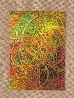
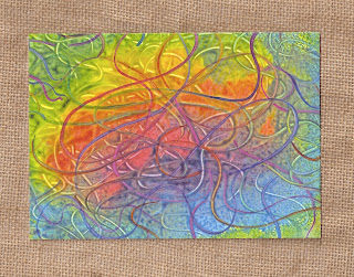
Hypnotic Form and Colour
 A few weeks ago we spent a little time discussing our art work and decided it would be worth putting together more cards to improve our range. We did however decide this next batch should be different and demonstrate a greater depth of colour and abstract form, this put the task very much into Jenny's court. We have had concerns in the past over the representation when printed, however the printers we used for our previous print run had produced a very good quality product and we felt it had an excellent chance of being done well.
When the cards arrived during the week we were well pleased with the result. Jenny has a keen interest in the use of colour and form in her work particularly regarding the psychological impact and effect and the human mind and perception. A number of people have found themselves studying her work and being mentally drawn into the image. The result can be quite hypnotic and relaxing.
The cards will be going onto our Etsy shop this weekend. We hope you enjoy her work and find time to let your eyes wander around the lines and hues.
(Blog post by Al, artwork by Jenny)
Subscribe to:
Posts (Atom)


